Business Overview
FontCompass is a comprehensive typeface classification system I created over a period of one and a half years in the mid-2000s for two closely related reasons.
First, to help quickly identify fonts when rebuilding logos as vector artwork in Adobe Illustrator for Leeward Productions, the custom license plates business I operate. Half the time customers do not have their original, high-resolution logo artwork available. The best they can furnish is often no better than a low-resolution bitmap image from their organization’s website, which can serve only as a template for rebuilding the logo from scratch. (Bitmaps like JPGs, PNGs, and GIFs can’t be used for screen-printed license plates. Even if they could, the resolution is too coarse when such images are enlarged enough for use as license plate artwork.)
Second, finding a font, or fonts, with just the right “flavor” or appearance for any given design project — especially car tags where large lettering usually contributes at least half, and sometimes all, of the “look and feel” — is a key factor in the success of the design. (See examples of my car tag design work.)
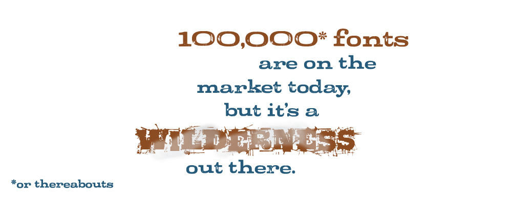
Whenever the subject of a universal, comprehensive typeface classification system comes up in font forums, you will typically hear typophiles say it can’t be done. Or at least not done well in an orderly, logical way that makes sense and is easy to use. “They” say there are too many ways fonts can be classified, and too many fonts are hybrids that don’t fit neatly into any one category. But in fact, it can be done, and in a way that takes both those considerations into account.
FontCompass is now a tried-and-true system I’ve used on the job week in and week out for close to 10 years. It’s practical, it’s been honed over time, and it just works. That said, it does require a bit of education about font design — but that’s something easily learned as you use the system. And while some might contend that’s easy for me to say as a typographer of 30+ years’ standing, I don’t think so. I would suggest instead it’s specifically because of all those years of experience, and hammering away at the issue of finding “just the right font” for many projects over many years, that the light gradually dawned about how to finally make such a system work — both for me, and for others. Because I am no different than other designers when it comes to trying to discover the specific visual look and feel I want for a project.
I actually started playing with classifying fonts as a freelance typographer in the early 1990s when publishing my business’s font library list for clients. Then, the idea was to make it easier to scan the collection and get a good overview of what was available. It was only after another 10 to 15 years of experience that the ideas floating around in my head about how to do things better finally began to gel into the overarching system that became FontCompass.
While there do remain some areas in the system with deficiencies or aspects I would like to remedy or revamp somewhat, overall it’s still a very useful system as it currently exists. And I believe it’s in a finished-enough state that I can release it as a proof of concept.
Right now, FontCompass is a system I’ve built within Extensis’ Suitcase font management application for my own private use, utilizing Suitcase font sets to categorize fonts, and Suitcase’s font previews for the font specimens. My long-term objective, if the system were to be released to the public in full, however, is for FontCompass to exist as a stand-alone entity on its own website.
This is not something I could accomplish all on my own, and would require help with. While some aspects of the endeavor could be crowd-sourced or enlist the help of numerous volunteers, however, I strongly believe the actual font classification or tagging work is not one of them, otherwise there is no coherence to the system. For this you need a small group of individuals with wide knowledge of both font design and the history of type working in concert with each other.
This is the key problem with MyFonts.com’s tagging system, for example. I purchase many fonts there myself, and love just about all other aspects of their website. They have all the database software pieces in place that are needed for an excellent font classification system. But unfortunately, the crowd-sourced approach they’ve set up and turned loose on the actual categorization work has made a helter-skelter hodgepodge out of it all.
Other aspects of FontCompass, though, could be, and would need to be, crowd-sourced, or at least accomplished with the help of a stable of volunteers, such as generating font specimens. (Since FontCompass would be independent of any particular retail font vendor’s website, it could not achieve the status of a universal compendium if limited to any such source of fonts where font-specimen generation is performed on-the-fly by software. Thus, the need for volunteer or crowd-sourced help in creating the many font specimens required.)
Wherever possible, I’ve specifically set up a dual-track approach of classifications within FontCompass based on both the specific physical design characteristics a font category exhibits, as well as the more general “look and feel” it evokes, whichever suits your way of working better. In other words, it’s a system for both so-called left and right-brained individuals.
Take a sneak peek, and see what you think.
Update: I have decided against a sneak peek at this time. However, you can find more about the genesis and current status of the project in the blog post, Work Has Begun on the FontCompass Website.
next: Portfolio →Portfolio
Will reveal a small peek at the FontCompass type classification system.
← return to: Business Overview