“Reverie Massage Music Playlists” Masthead
Top Menu > Work > Reverie
After having focused on three business mastheads in a row, I was feeling the need to dive into something more fluid and nature-based, design-wise. In fact, that idea had been part of the impulse behind the main Hermit Spirit masthead itself. Or at least something with an organic, textured look, which is what I had originally planned as an underlying theme for most of the mastheads.
You can read more about the Reverie idea here, but in a nutshell, the playlists arose out of the need to put together the right kind of music to accompany regular deep-tissue massage sessions I began getting many years ago. Back then, I had developed repetitive-stress syndrome from years of computer work, tried several different things over an extended period to manage it, and found massage worked better for me in helping do so than almost anything else.
Over time I put together more and more playlists of different types of music, with a common thread running throughout: The music needed to be both relaxing but also captivating, even mesmerizing, for the one lying on the table, but also potentially energizing for the therapist. Definitely not the boring, insipid, saccharine, or sleep-inducing fluff that so much so-called yoga or spa music unfortunately seems to consist of.
When I decided to create a section of the website for publishing these playlists, I came up with the name “Reverie” to call to mind the daydreamy, absorbing mental state I intended them to elicit. So… when designing the Reverie masthead, what kind of image might best evoke that?
Two potential directions, but which one?
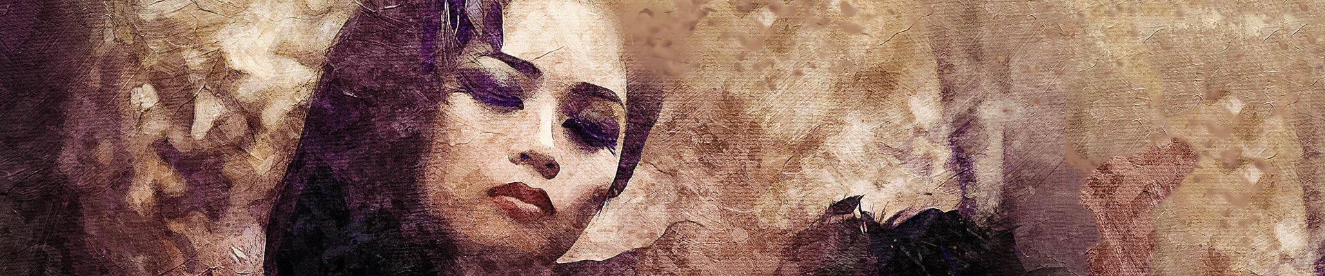
My first idea was to feature some sort of natural, starkly serene, Zen-like landscape, and those were the types of images I started searching for. As I pored over and steeped myself in the images that surfaced at Pixabay, though, I could feel the softer side of my being taking over. A second direction emerged: What about a close-up of someone’s face reveling in some kind of inner rapture?
Of the many photos that suggested the above two atmospheric moods I pulled up and scanned through, there were a number I liked but weren’t appropriate for making a masthead out of. It’s worth mentioning that such images went into the “idea file” I collected, regardless, because they could still prove helpful as cues to refer back to as inspiration for the overall sensibility I was hoping to capture. (Very common with graphic designers, one would think, though I don’t talk to many.)
The following are the remaining images that made the final cut and whose backgrounds lent themselves to extending to panoramic width in Photoshop (click any image to enlarge):


I was torn between four of the images and couldn’t make up my mind. As a “push,” I decided to go ahead and extend their backgrounds (mostly using Photoshop’s content-aware fill and/or content-aware scale) to see how each worked out and to help decide:

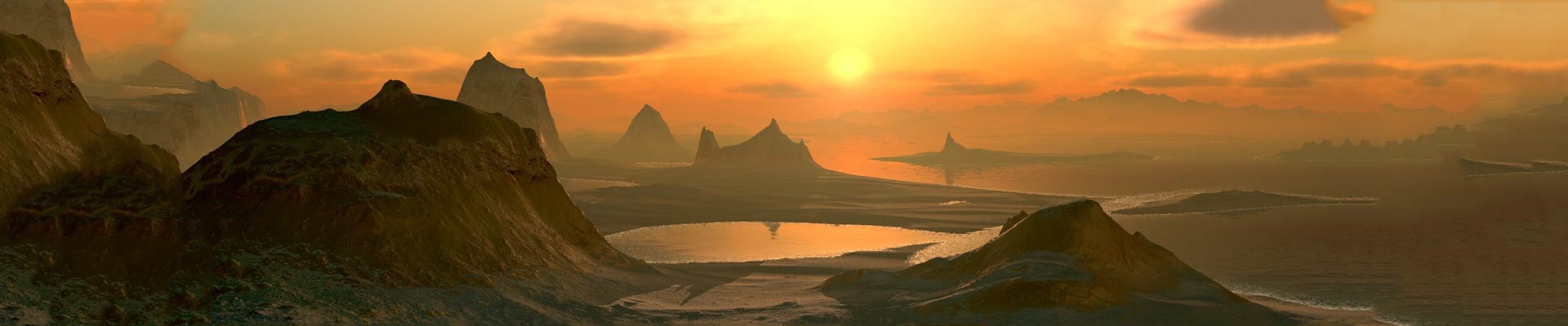

Before extending the backgrounds, my initial impulse had been to go with the arresting bright yellow, orange, and red landscape image featuring the lone tree — the first one above. As I worked with the images in Photoshop, though, my feelings began to change. The image would have made a great masthead. However, I decided these sorts of “Zen landscapes” are by now perhaps too overused in album artwork for the target audience of people trying to find music for serenity, massage, yoga, or ambient listening.
What I wanted for myself — but what would others say?
Even though I felt I could do better with this image than the usual run-of-the-mill treatments, I decided to go with one of the images of women. The third image just above was too posed for my taste, and in part for that reason I opted for the Indonesian woman. (Also posed, no doubt, but less obviously so.) But I have philosophical and spiritual leanings toward Eastern thought, culture, and images, too, that pushed me in that direction.
I still hesitated for a while, though, concerned some people might perceive the image as focusing too much on the model’s physical beauty. (Yet another man objectifying women! Pfft!) But eventually I came to the conclusion: You know what? I don’t care: I’m going with my gut on this. I want an image that strongly pulls the viewer into the humanity and emotional dimension of the concept.
For one thing, it would be a bit unusual to use this kind of image for the type of music playlists I’d created, which I felt was good. And almost no images of men came up in the searches I had done seeking out the type of emotional appearance I was after, none of them particularly good. (When hunting for images on sites available either for free or with reasonable pricing, the selection may be somewhat limited.) Plus, I’d already used a very in-your-face image of a man for the main Hermit Spirit masthead. Am I therefore objectifying an old man for being typically old? Sheesh — enough!
For another, there’s a pronounced feminine aspect to my psychological makeup that comes out in certain things like design, the anti-macho streak I have in general, my feelings toward nature and animals, and of course my musical tastes as evident in the Reverie playlists themselves. Which brought up the likelihood more women than men are into the type of music that makes up the playlists, and this image would be most expressive of it.
Marrying the headline to the image
That decided, I moved on to the lettering. At this point, I was working mostly intuitively — in “internal feminine” mode — and so can’t give 100% rational reasons why I chose the typefaces I did here, other than token ones. For example, as with many of the mastheads, I wanted a font with a somewhat horizontally extended design to more easily stretch a good distance across the panoramic image.
Beyond that, Silas Dilworth’s Diego quickly sprang to mind for the headline as a font I’d added to my library some years back but still hadn’t had much opportunity to use. It “clicked” right away, had the right features, and just worked. I also tried Bolyar and Newtext, both horizontally extended designs as well, because I often like trying alternatives to see if my first impulse is really the best or not. But in both cases the tone somehow didn’t quite jibe. (I would later utilize these fonts in the 404 Error and Writing mastheads, respectively.)
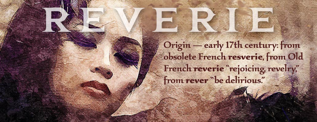
One thing you learn in graphic design over time is to crop images tightly in most situations — both to focus in on and frame the most compelling portion of an image, plus enlarge it as much as is feasible for maximum graphic impact. So I automatically did that here, but then the challenge was how to position the headline in the reduced space available, also at as large a size as practical, in a way that didn’t obscure the model’s face too much. Here is the result:
Bending the rules about contrast a bit
For many photographic images with type running across them like this, the best solution is to use pure, opaque white for the lettering for highest overall contrast against the range of varying photographic colors behind. In addition, applying a drop shadow to the font will further separate the words from the background to enhance legibility. I had done both of these for the Hermit Spirit and Hangman/Picture-Hanger Guy mastheads because of the somewhat “busy” backgrounds underneath the lettering.
In this case, though, I didn’t want to obscure any more of the model’s features than necessary with fully opaque white lettering or a dark drop shadow. Fortunately, the image in the area layered beneath the headline was not very busy, mostly forehead and hair.
The solution, then, was a combination of three things: (a) Letterspace out “Reverie” to allow more of the image to be seen between characters, (b) Employ pure white for the type but reduce its opacity so the model’s face would partially show through the letterforms themselves, along with a bit of color, and (c) Use a lighter drop shadow. Doing these things worked because the font size was large enough to compensate for the contrast reductions.
The result appears softer with less “pop,” in keeping with the underlying feminine feel. Also, a bit of the “canvas” texture applied by the image’s artist to the underlying photo shows through the lettering this way.
A caption to define the headline
Since “Reverie” is a word that might be unfamiliar to some of the audience, I included the dictionary definition of the word as a text block below the headline to help introduce the concept. Fortunately, the copy embodies more flair than the typical dictionary entry, adding a bit of mystique to the presentation. The typeface used here is Phill Grimshaw’s Kallos, which incorporates elegant calligraphic features that compliment the gracefulness of the model and the overall naturalistic treatment of the image.
To color the caption, I sampled a range of tones from the woman’s ocher lipstick, experimenting till I found a shade that was dark enough for decent contrast, but not so dark its color became hard to distinguish. I could have used black to make the caption stand out from the background tans and golds on its own as much as possible, and tried doing so. But it didn’t harmonize with the rest of the image as well as the reddish-brown.
That decision required increasing the contrast in some other way, however. I turned to the tried-and-true technique for making dark-colored type stand out against a photographic background and added a soft glow effect behind the caption. Enough in this case to make it readable, but not so much that the result would draw too much attention to itself and spoil the subtlety of the image’s beautiful organic texture.
“Work Overview” masthead
Top Menu > Work > Work Overview
For the previous “Think Outside the Box” version of the website, I had reached the end of my rope mentally after wrestling for months of on-and-off spare time with the Headway theme’s CSS (cascading style sheets) to style the typography to my liking for the main content area, nav menus, sidebar, and footer. After that, I had little energy or patience left to design any headers beyond the main site masthead.
So for the Work Overview masthead — as well as all the individual Work submenu page headers — I had created a knockoff version of the main masthead, substituting a “word cloud” outlining the skills at which I make a living. Then, for each of the individual Work pages, I simply put a glow effect around the specific term or phrase in the word cloud that pertained to the site section over which the header appeared.
Here’s the previous Think Outside the Box site masthead again for reference, followed by one of the knockoff versions in the Work series — the Writing header, in this case:
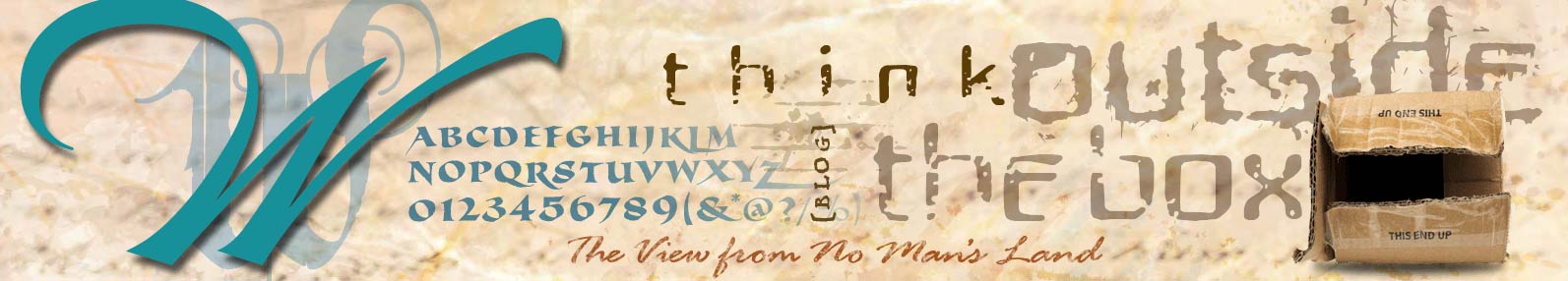
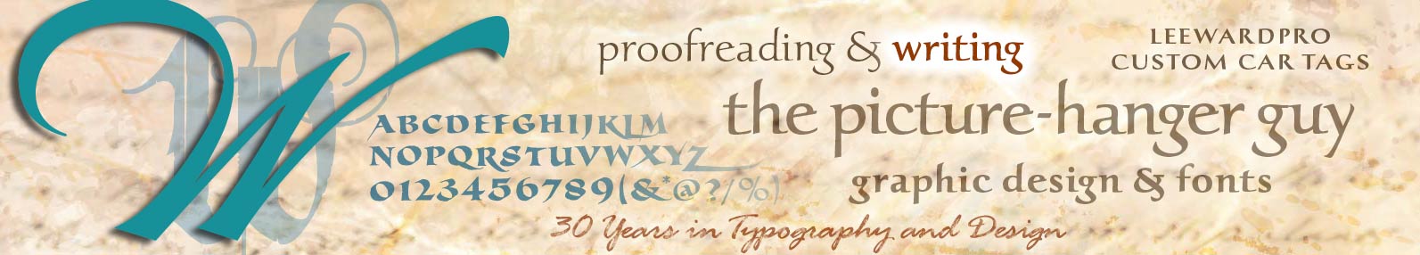
I wasn’t particularly jazzed with the latter “one-size-fits-all” approach. Without a strong focal point, it lacked punch — even after using the glow effect to highlight a specific, individual Work section. Ideally, each Work page needed a unique section header all to itself.
This time around, with Hermit Spirit, after having designed the main masthead and spending not much longer than 10 days to two weeks’ spare time porting over the bulk of the most-needed CSS from the previous site, I had sufficient time and energy to devote to the task.
Work Overview upgrade for the redesigned site
So far, we’ve covered three of the Work series mastheads in Part 2 (Hangman/Picture-Hanger Guy, Proofreading, and Leeward Productions) plus the Reverie masthead here in Part 3. You might be wondering why it was only at this point in the design sequence that I got around to creating the Work Overview masthead for Hermit Spirit. Why first design the four other mastheads we’ve covered that are submenu items under Work on the main menu bar? Because I wasn’t sure earlier how to capture in a single image what all the different activities I do for work (and play, also, such as Reverie) have in common.
Usually when I put my attention and focus on the copywriting or design “creative” and start chewing into it, something comes to me soon and I can brainstorm at least a few things that seem promising pretty quickly. Normally I don’t have to work at it too hard. It just seems to be the way my brain is wired.
Of course, the individual Work submenu items had inherent focus built into them as activities with a clear nucleus which it was easy to brainstorm around. The main menu item Work Overview as an “umbrella” concept, though, was more diffuse and generic. In this case, a creative concept eluded me at first. But I didn’t push it.
“Wu wei” as design tactic
Over the years, I’ve learned it’s best not to force things like this if not required — to let them percolate for a while instead, as you solve other related issues. If you exercise some patience and just trust in the process, “seepage,” osmosis, a subterranean bubbling of conceptual associations, or some other subconscious process will usually float something up to the level of conscious awareness without too much undue delay.
Similar to the Taoist concept of “wu wei,” the approach is an active form of inaction, getting out of your own way. As things simmered in this way, eventually I realized that the thread of all the years living as a “self-employed” connecting the various Work submenu items provided the creative takeoff point itself.
Self-employment has not been an easy road, but I’ve kept plugging away over the years, and so it was the very experience of that that became the theme for this masthead. After recognizing this, it wasn’t long before an idea popped up. I love animals: What about some hard-working, tireless little animal that keeps on beavering away?
Of beavers and dogs
And speaking of “beavering” away, what about that? The image of a beaver seemed worth pursuing, and I found a couple that seemed promising. On hearing of it, though, my wife didn’t like the idea: a yucky creature. I thought — and still think — I could have made the idea work, but considered what she had to say.
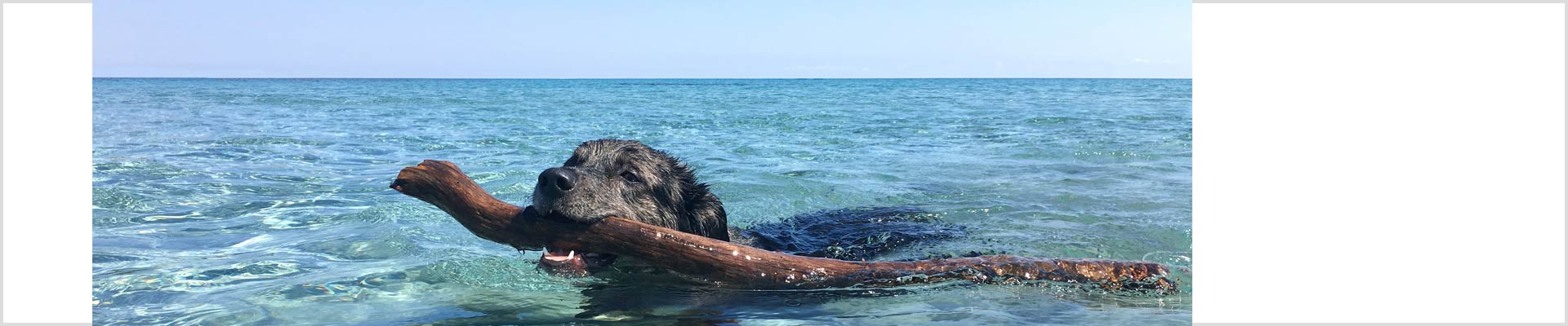
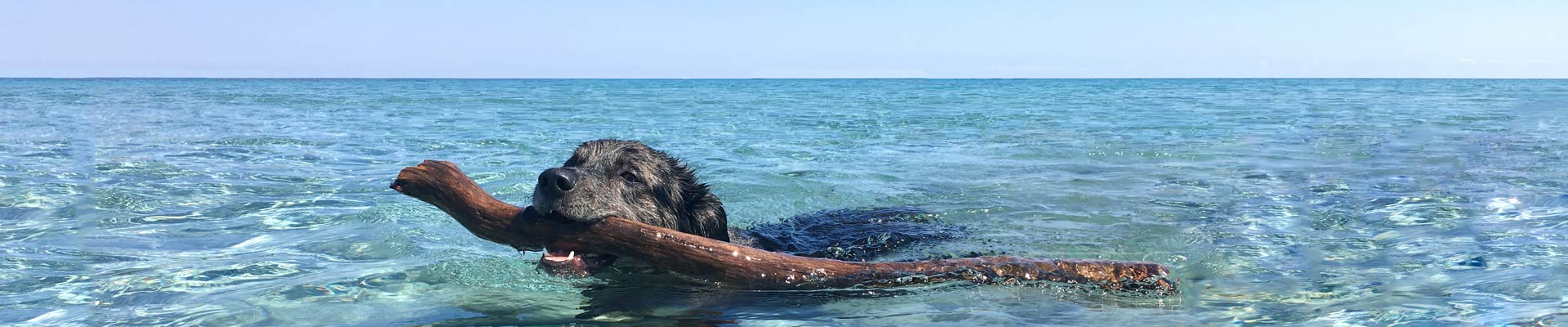
Okay, then, what about a dog paddling away in the water? Just about everybody likes dogs, including me, someone who’s by nature more of a “cat person.” Probably more “relatable” than a beaver. Let’s go down that road for a bit and see how it compares, I said to myself.
When I searched for dog-paddling images, almost all of the dogs were fetching sticks with their mouths. Ah, now that sure gets across the idea of someone faithfully performing a task in a plucky way. Here are the images that caught my eye, including one exemplifying what I had in mind for the earlier idea of a beaver:


Bending reality a bit
I liked the final image above best, in part because the stick the dog is swimming with back to shore is longer than he/she is — making the photo particularly, shall we say, “fetching.” The image also had a built-in, true horizon line, lending itself more easily to a panoramic header treatment.
As a first step in remaking the photo into a panoramic image, I cropped out the unneeded portion of the image below the dog and stick, along with a slice of sky at the top, to increase the horizontal aspect ratio. Also, the lower portion of the image below the dog reveals it’s actually in very shallow water, feet perhaps even touching the bottom. (Take a look back at the original, uncropped image in the photo gallery above.)
Inconvenient little issues like the latter illustrate how you rarely find “the” perfect image, at least in my budget-limited world, so you take what you find and make it work. Which actually turns you into a better designer over the long run due to the adaptability, flexibility, versatility, and resourcefulness it elicits.
Content-aware fill in Photoshop did not work as well as I had hoped in extending the seascape to the left and right. A good deal of patching, cloning, and accompanying retouch work was required to make the added water and waves on the left and right look natural. Below are the before/after versions of the image:
Reversing the creative sequence
Most often when it comes to a creative concept, either the headline occurs to me first, or the headline and image occur as a pair in tandem. Here, though, the visual occurred first, with no particular direction for the headline. So I worked on the image first and got that laid to rest, while letting the verbal side of things stew for a bit.
The sentiments behind the self-deprecating, gently humorous caption in the finalized masthead below occurred to me next, and weren’t difficult to turn into words. For a brief period I brainstormed headlines, then relaxed and gave it space, and eventually it naturally surfaced.
Rather than taking the usual path of putting a targeted spin on the headline or framing it in active terms to suggest a specific direction, I just let it function as a descriptive label — “The Self-Employed Seas” — for the sea itself. Running the type along the surface of the sea right at the horizon line, the letters listing from side to side a little (a built-in feature of the font itself here) like something floating on the water, gave it the only interpretive push really needed:
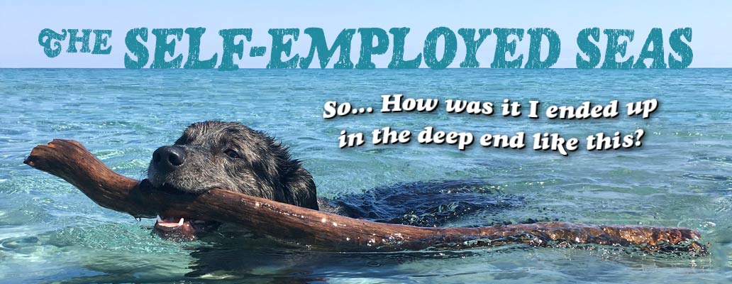
The two fonts above are closely related: For the caption, Goudy Heavyface Italic, a golden oldie by Morris Fuller Benton (designed in 1925) and Ray Larabie’s Rinse for the headline (2007), a modern grunge interpretation of the same font. The appearance is lighthearted and a bit whimsical but also bold and assertive. Typesetting the caption in curved fashion like an undulating wave communicates an additional touch of fun tying the scene together.
To begin with, I tried Rinse for the caption. But the “corrosion” effect at the smaller size just looked like something was wrong with the font, so I tabled that decision for a time and used Rinse for the headline instead. Then I remembered the original font that Rinse is based on, which worked much better for the caption.
All told, the masthead telegraphs the kernel of a story in a single glance.
It looks like my prognostication in Part 1 of a three-part series has turned out to be about as accurate as the typical weather forecast. The design of the remaining Hermit Spirit site mastheads to be covered here went more quickly once my mojo really got rolling, so perhaps the write-ups of them will be correspondingly shorter too. We’ll see about that, eh?