“The Hangman and the Picture-Hanger Guy” Masthead
Top Menu > Work > Hangman/Picture-Hanger Guy
This was the next header I tackled after the Hermit Spirit blog masthead. Why? Well, the web page it sits atop brings in some extra inquiries for a gig I’m involved with that helps pay the bills. We’re talking basic “keeping the wolf from the door” motivation here. Despite the fact I wasn’t going to release the new website redesign until all headers were complete, I still felt an internal push to create the mastheads publicizing current income-producing endeavors first.
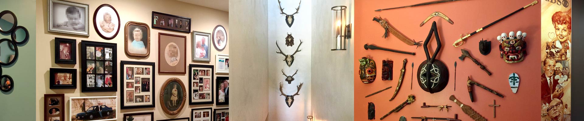
Unlike all the other headers, I didn’t need to search for any images to be used for this one. I’d taken plenty of photos with my smartphone of completed picture groupings and other wall hangings on actual job sites where my partner and I had worked. From those, I narrowed things down to the potential photos shown in the gallery below (click any image to enlarge):


In mulling over how many photos to feature in the masthead and how to arrange them, I realized three photos in the header’s central viewing area would be plenty. Otherwise the layout of the photos themselves would get too “busy,” and they’d need to be significantly reduced in size to fit the available space. That, in turn, would sacrifice graphic impact and good viewability. There was enough going on in any single photo to begin with, since virtually all of them featured groupings rather than lone items on the wall.
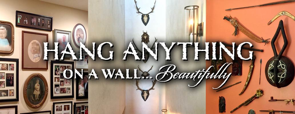
When selecting which photos to use, a key aim was showing that we don’t hang just pictures, but almost “anything on a wall” that can be hung. To illustrate that, for the three main photos I chose a large picture grouping we’d done, a second one showing antler mounts, and a third featuring unusual tribal artifacts.
Photo layout
Keeping things as simple as possible, I placed the photos side by side as opposed to arranged in some kind of collage. I cropped them cleanly and fairly tightly, but not so tightly they weren’t still recognizable as shots of completed wall hangings.
The three central, primary photos would retain decent visibility even on small smartphone screens. Coming into play on large, 16:9 theater-aspect-ratio computer displays would be fuller views of the leftmost and rightmost members of the central three photos, plus another two photos flanking those, one on the far left side, and one on the far right. Here’s the full mega-wide panoramic header (click to enlarge):
Writing the headline and setting the type
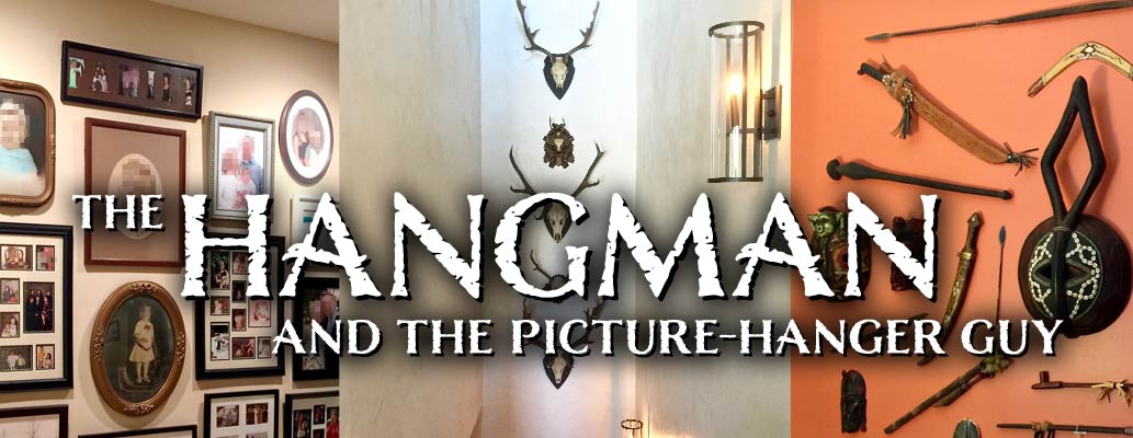
In the first take of the masthead’s headline, I used a shorter version — “The Hangman and the Picture-Hanger Guy” — of the same wording employed in the WordPress page title located just above the body copy in the main content area.
There was no perfect way to place the typography without obscuring something behind it. At this stage, I placed it below vertical center to avoid covering up too much of the large, round tribal item at the far right and to steer clear of the wall sconce above the headline. Here’s the interim result:
I immediately ran into an obvious issue, however, one I hadn’t really thought much about till then, though I should have. When I saved the masthead from Photoshop and inserted it into the actual website page, there sitting right below it was basically the same headline in the page title, repeated. That wouldn’t do, of course.
One legitimate solution would have been to simply suppress display of the WordPress page title in the main content area below the masthead. Or, the page title below could have been rewritten. However, it made more sense to retain the page title as it was and rewrite the masthead title instead. Page titles and the keywords used in them are important for search engine-ranking purposes — and I had written the page title with that in mind for the first version of the website two or three years earlier.
The better solution was to take advantage of the masthead with its larger, more compelling typography to highlight a prime reason people might want to employ the Hangman and Picture-Hanger Guy service. In other words, use it as an attention-getter, like an advertisement, but as tastefully as possible. There are several benefits our service offers, but I decided to single out the way we can hang things so they look really nice, perfectly positioned for best effect, and grouped in a beautiful arrangement when a few items or more need to go together.
Reworking the headline and lettering
With that in mind, I created a new headline for the masthead, “Hang Anything on a Wall… Beautifully.” Below is how things looked after rearranging and restyling the typography. I also moved the headline upward to center vertically over the image underneath, even though it covered up a couple of items in the image that had been visible in the previous version.
At this stage, my overall plan for the typography throughout the series of mastheads was to convey an organic, naturalistic feel. (Later, I loosened up and then abandoned that directive altogether.)
For the all-caps lettering here, I chose a typeface I’d purchased within the previous couple of years (on special, to save money) but had not had much occasion to use yet: Nelson, by Laura Worthington, one of today’s most talented young font designers. The feel is stately and refined, based on classic Roman letterforms — just right for the higher-end clientele willing to pay for a service like this. Complementing Nelson to accentuate the word “Beautifully” is another Laura Worthington typeface, Origins, also rough-edged, and drawn with a crow quill on parchment, exhibiting her fluent calligraphic hand.
I put this masthead version in place on the staging-server prototype of the new site, while moving on to work on others for a while. I liked the fact the headline was only six words on two lines. But later, the absolutist nature of the claim “Anything on a Wall” started to bother me. While we can indeed hang anything that’s hangable, in reality there are a few items we’ve learned it’s better to leave to other tradespeople, such as draperies and flat-screen televisions. (I won’t go into why here.)
Revising and resetting the headline, one more time
One of the challenging, sometimes frustrating things about writing the pithiest headline possible is that while fewer words are usually better, it sometimes inadvertently leads to claims that are too absolutist, as with “Anything on a Wall.” So to qualify the claim, you’re forced to either add more words, insert an asterisk, whatever.
In this case, I was able to get by with adding just a single word: putting “Almost” before “Anything.” The downside was if I wanted to keep the point size of the largest words as large as previously, which I did — to maintain the same visual impact — I’d have to do one of two things.
Choice number one would be to allow the first line of the headline (now three words, “Hang Almost Anything”) to extend horizontally as wide as required at the preexisting, large point size, with the result of bisecting the image into two almost completely split-apart sections, one above the headline and one below. (This would have been the case in the cropped version of the masthead for smaller and mobile displays, although not for computer displays.) Or, I could stack the typography on three lines instead of two, to prevent dividing the photo in half.
I chose the second option at the cost of covering up more of the image behind, but found a way to break and position the lines to achieve a nice balance. The result was the final version used for the masthead. Shown first is the cropped version for mobile displays, then the full panoramic view seen on large computer monitors:


A note about photo confidentiality: In the pictures on the left-hand side of the masthead, as well as others in the gallery of candidate photos further above, I was concerned to disguise the identities of any individuals who might be recognizable and maintain their personal privacy. To do that, I used the Mosaic filter in Photoshop to pixelate any recognizable faces, or names on certificates, enough to achieve that aim. (Click the above images for a closer look.)
“Proofreading for Ad Agencies” Masthead
Top Menu > Work > Proofreading > Ad Agency Proofreading Service
This header took next priority in the masthead design sequence, as the second of my three current money-making pursuits. Up to this point, my proofreading clientele has come via word of mouth, harking back to a few personal connections made at two advertising-agency jobs some years ago, at both of which I worked as a proofreader and production artist. I’d like to expand the income stream coming via this avenue, but the word-of-mouth chain hasn’t extended any further for some time now. So the idea is to see if I might be able to pull in more ad-agency proofreading work, my specialty, from the internet.
I didn’t have any headline or visual idea to start with for the masthead, so I just started browsing images on Pixabay and iStock for inspiration to see what I might find. Nearly all of the images pulled up in response to the search phrase “proofreading,” though, were hackneyed and clichéd — hands holding pens circling misspelled words on paper, or inserting corrections, or rubber stamps that said proofed, that sort of thing. There were so many of these, in fact, it was depressing. (Bleah.)
A spark of humor to kick-start the design
Then, lo and behold, an image popped up showing a concrete sign in front of a prison that said “Department of Corrections,” which started me cackling. (Yep, a bit of a perverse sense of humor on my part. But it also would’ve been interesting to meet whoever had the idea to classify the image under “proofreading” as a query.)
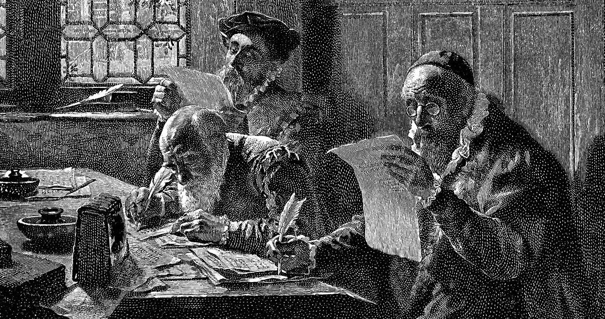
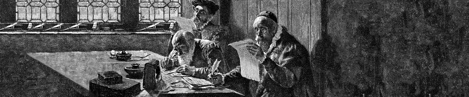
Not too much later, I ran across an image of 16th-century proofreaders toiling away on the job. It had started out in life as a contemporaneous painting, then later was made into an engraving in the 1800s. And a detailed photograph of this engraving had been made available for download on iStock.
Though realistic in depicting how proofreading was done back in that day — letterpress printing on parchment paper along with honest-to-goodness quill pens — the image was also humorously executed, or at least I thought so. Two proofreaders, each holding up a sheet to better catch the sunlight coming in through thick-glass windows, plus a third hunched over the group’s worktable peering at his parchment proof with quill-feathered pen in hand.
Here are the candidate images that led to the idea for the masthead design:


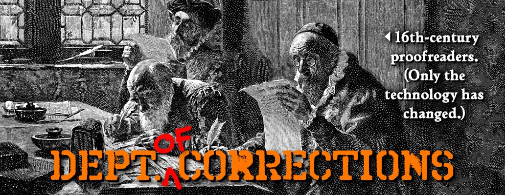
The 16th-century image was just perfect for the header, I thought, with its perhaps unintentionally humorous portrayal. The next step was to determine top and bottom cropping for the image, and then extend the left and right sides to the full 1,920 x 400-pixel masthead width, as shown in the two before-and-after images below:

Typesetting the headline and caption
The above task done, I took the entertaining “Department of Corrections” idea prompted by the concrete sign image and made that the headline, typeset in orange prison-style stencil lettering running across the lower part of the picture — except I purposely omitted the word “of.” The all-caps lettering here uses Ray Larabie’s Octin Spraypaint B Bold font.
Then, to inject a bit of fun and “correct” the misstated headline, I inserted a handwritten, proofreader’s caret mark and the word “of” — both in the profession’s characteristic, bright red ink — between “Dept.” and “Corrections,” using Mark Simonson’s Felt Tip Roman Bold. The caret mark is actually a capital “V” turned upside down.
After that, I added the caption on the right-hand side of the image using Ticonderoga, a Venetian oldstyle serif design in keeping with the Renaissance-era scene, to finish things off. Below, the cropped version for smaller devices is shown first, then the panoramic version for large displays:

You can see various imperfections in the horizontally extended background to the left and right sides. My patience for more Photoshop scutwork at the time was at an end, though, so I elected to let things ride. At some later date, I will probably go in and fix things up better.
A failed grunge experiment
As an experiment, one that fizzled out, I also played around and tried my hand adding a grunge treatment simulating splattered red ink drizzled onto the image:

Deciding better of it, though, I called things good and moved on to the next masthead.
“Leeward Productions Custom Car Tags” Masthead
Top Menu > Work > LeewardPro
Along with the previous two headers covered above — for picture-hanging and proofreading — this one rounds out my current triad of income-generating activities, and so was next on the roster. Of all the mastheads, its design went quickest because I elected to reuse the same two auto tag images featured in the Leeward Productions website masthead itself, in the same overlapping, angled configuration. (Click the second image of the two in the photo gallery box below for the full monty.)
I should mention that the current LeewardPro site design is getting long in the tooth with a somewhat old-fashioned and intentionally space-conserving header, and coming due for a redesign of its own when I have time. Here, I wanted to place the same two car tags from the LeewardPro site header on some kind of textured background, and chose the marble pattern you also see just below (click to enlarge).


For good contrast against the car tags’ outer edges that incorporated a white margin, I needed to make the lightly colored marble in the original Pixabay image much darker. This was accomplished quickly in Photoshop via a Levels layer.
Fortunately, the marble texture was high enough in resolution that I didn’t need to spend any time extending the pattern to panoramic proportions, and just cropped a slice out of it as needed to fill the full masthead height and width, like this:
Avoiding competition between stacked lines of type
For the headline below the juxtaposed car tags, I simply repeated the Leeward Productions website header’s tagline, “The Design Leader in Custom Promotional License Plates.”
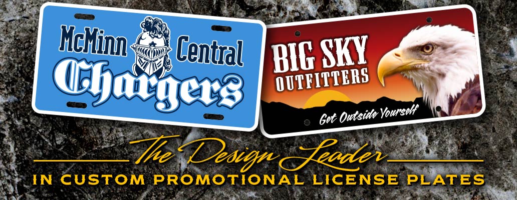
A bit of a challenge at first was deciding what font to use that wouldn’t conflict with the large lettering used in the two license plate designs just above it. This was an issue since I wanted to make the first line of the tagline here, “The Design Leader,” as large as practical. But that meant it would end up similar in size to the fonts used in the two license plate designs just above it.
Avoiding “competition” between nearby elements like this is a fundamental principle in graphic design. Using differences in scale (big headline above smaller subhead or tagline, for example) is one of the tried-and-true ways to do so when possible, but sometimes that avenue is closed off, as in this case.
Script fonts are often a good way to solve this kind of issue, since their flowing curves provide maximum typographic contrast with upright/roman letterforms like those used for the bulk of the car tags’ lettering here. Particularly with a script modeled after handwriting like the one I decided on — Sofia Script, by Chuck Davis of Letterhead Fonts — you get the maximum contrast in situations like this while avoiding any perceived clash. And it doesn’t hurt when you’ve got a font such as Sofia that adds extra pizzazz as part of the bargain, courtesy of a talented, vintage sign-lettering artist and type designer like Chuck.
Wrapping it up
The second line of type, “in Custom Promotional License Plates,” to my mind, required a horizontally extended typeface because I wanted to keep the cap size small in relationship to “The Design Leader.” Again, for contrast, to allow the latter to stand out as much as possible so neither line competed with the other. Another typeface from Letterhead Fonts, Woodmere Spurs, by John Davis, fit the bill for that.
A light, bright color for the headline was required for it to pop out from the dark marble background. I chose a bright yellow to contrast with the dominant white of the car tags’ lettering, while simultaneously tying in with the yellow of the sun and eagle’s beak in the right-hand tag.
Finally, to add some structure to the two lines of typography beneath the car tags and help them better hang together as a combined visual unit, I added the thin horizontal rules to the left and right of “The Design Leader.” And in fairly short order, that took care of this masthead.
You, sir, are BRILLYANT! Love reading about your creative process. The website is live, more pages will be added. I’m thinking of doing something similar to what you did – showing corrected proofs and how long they took to correct. Request permission to add a link to your website on the Proofreading References page.
Aw, shucks, thank you for the compliment, Lori.
Link away — no need to ask permission for what you’re doing on your site’s references page. Looks like the article Connecting to Other Websites is a good overview of the situation these days, and confirms what I had already heard.
Basically, only a couple types of links will get you into trouble. One is linking in such a way that the other site’s content is pulled inside yours and could appear to be your own (usually termed framing). The other is pulling full-size photos into a page via hotlinking. Thumbnails are okay if done for fair-use purposes, but photographers typically reserve the right to reproduce full-size images for themselves unless specific permission is granted otherwise or you’ve purchased a license.
I know some years back, there were high-falutin sites claiming copyright infringement over “deep linking” (anywhere other than the home page). The courts have thankfully quashed that kind of nonsense, which I’m glad to see.