A week ago I launched the newly redesigned and rechristened Hermit Spirit website here after about two months of spare-time effort. Two major tasks were involved, the largest designing 12 brand-new mastheads for different sections of the site, including the home page/blog header. At the same time, I wanted to retain the typography and layout I’d previously developed for the main content area (body copy) plus the navigation menus, sidebar, and footer.
The latter task required porting the CSS, or cascading style sheets, from the preceding Think Outside the Box version of the site built on the now-defunct Headway theme into GeneratePress, which the current website uses. (Both are themes for WordPress.) I won’t go into the travails involved with the latter task because it’s code-intensive and not something most readers will care about. But I thought it might be of interest to take a peek behind the scenes at how I designed all the mastheads.
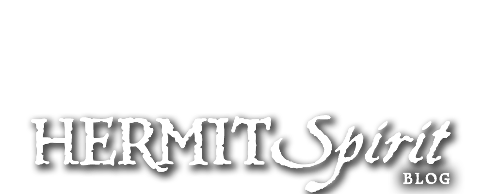
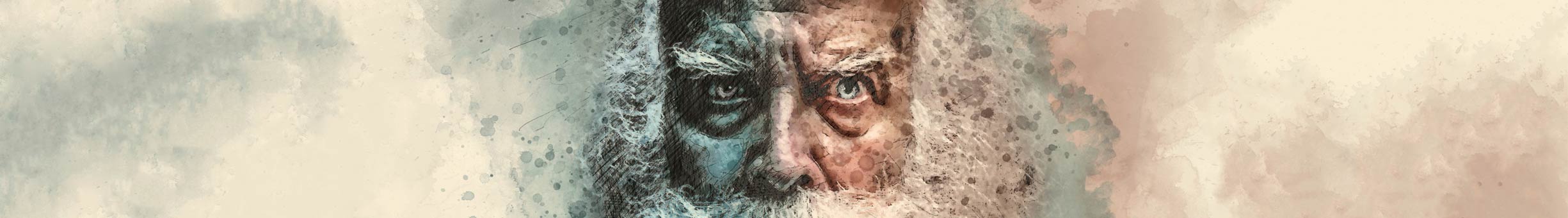
The main “Hermit Spirit” site and blog masthead
Homepage • Also: Top Menu > Blog
First, for comparison, here’s the previous Think Outside the Box blog masthead, followed by my new one for the retitled Hermit Spirit version. (Click on any image in this post to enlarge.)
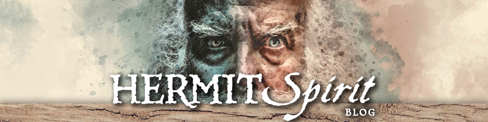
You’ll notice two things off the bat: The new blog masthead is much simpler, and deeper vertically (at 400 pixels) than the previous one (286 pixels deep). I found that the Think Outside the Box masthead — designed primarily for computer monitors — lost most of its impact on smartphone displays, which are much smaller but have now come to be used for a significant percentage of all web surfing. So my watchwords for the new masthead series were larger and simpler.
With the previous blog masthead I was keen to conserve as much vertical screen real estate as possible. Web usability studies in the past had shown that users often would not scroll past the first screenful (“above the fold,” in web design parlance, a reference to newspaper layout) if they didn’t immediately find anything of interest. But these days resistance to scrolling has dissipated with increasing experience among users, plus a whole new generation of them since.
Combine that with increasingly faster internet and computer speeds, and the result is today’s trend of using so-called “hero images” for website headers — very large, what I would call “in your face” images — as the modern way to design. (In the past such large images just slowed down page-load times too much.) People now want to take advantage of the fact photographs and illustrations have a lot of graphic impact and emotional power. So I decided to have fun with that approach on all the new mastheads.
I like a bit of an “organic” feel or “grunge” approach to design when appropriate, but toned down the grunge aspect for the headers this time around. Rather than grunge-up the layout itself, I focused such treatment mostly on selecting images and fonts with texturing and distressing effects when suitable, while following a more classic approach to typographic layout.
The blog masthead version that didn’t make the cut
Here’s a rough, early version of the masthead — using only “Hermit” for the title — that did not pan out. The colors were just quickie stylings to play with the layout, that’s all.
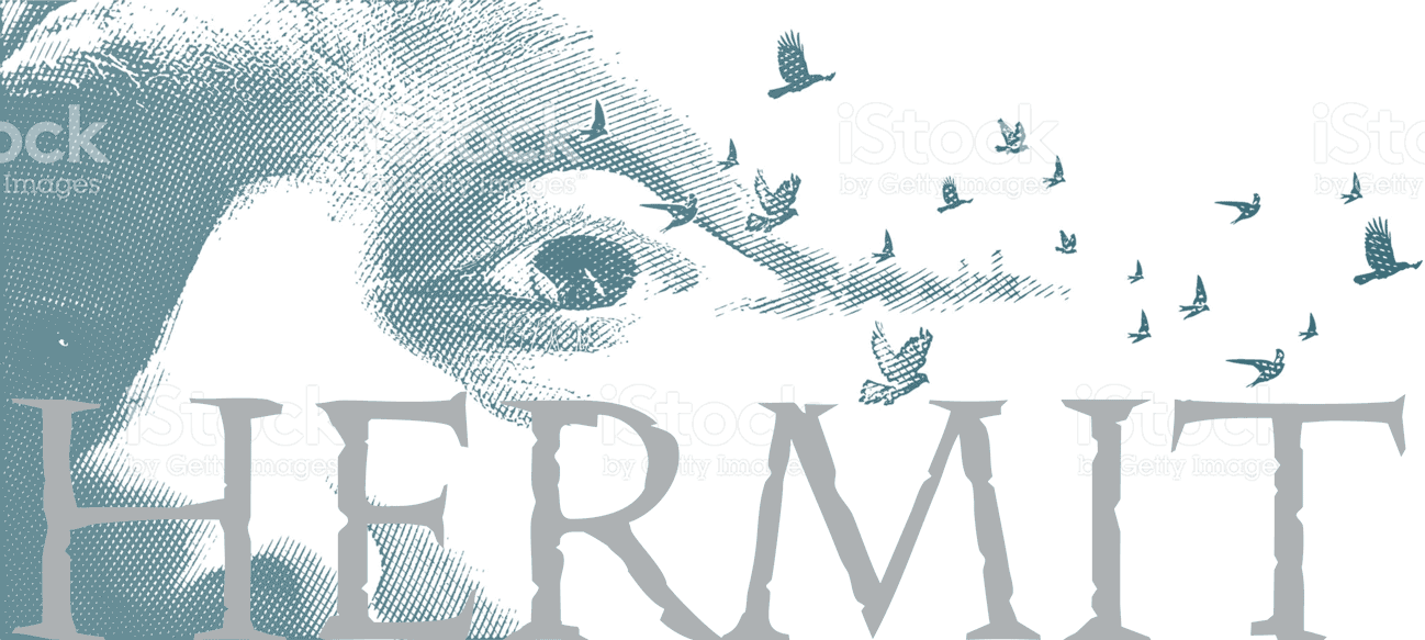
I liked the image, particularly its inclusion of the birds, giving a nice sense of mental or spiritual freedom and the flight of ideas, plus the connection to nature. However, the reason it didn’t pan out hinged on the issue that use of an image in this way for a blog masthead could potentially be construed as a logo. I began to worry about this, looked into the image-licensing terms from iStock, where I had gotten the image, and discovered they don’t permit use for logos. It’s not allowed even with an extended, premium license (as opposed to the standard one), so I decided not to risk it.
Instead, I started looking for public-domain images of old men who might appear to be hermits, and found Pixabay’s site, which I had not been aware of before. As soon as I saw the portrayal of the old man I’m using for the blog masthead, I was pretty sure it would be “the one.” But I continued to look for a while longer just to be sure.
Actually, prior to the idea of a head shot of an old man, the alternate concept of using an image of an old shack or abandoned house was in the running as well. Including those, here is the handful of candidate images I arrived at (click to enlarge):


After scouring Pixabay and a few other public-domain sites for possible alternatives, however, the old man image remained “heads above” the others, so to speak, in terms of compelling impact. I decided to run with it.
Ah, and to answer a potential question that some may have: Just to be perfectly clear, no, I am not the old guy in the blog masthead. But I like his attitude!
Selecting fonts and arriving at the layout
My original plan for the series of mastheads was to keep things as simple as possible by creating a common layout and font to be shared between all. This is reflected in the way the early version of the masthead above (that didn’t make the cut) is laid out: The intention was to use a font with a textured or distressed appearance — Pitchfork was the font I auditioned for this initial early version — set in all caps, with the baseline of the headline running across and abutting the bottom of the image.
But I ran into two problems. When I decided the blog title should be Hermit Spirit rather than simply Hermit, the title would no longer fit in the horizontal space I’d allocated at the headline’s original size. To maintain that cap height, I had to either look for a more condensed font or set it in upper-and-lowercase (or both) to reduce the horizontal space required. But if I set things in U/lc on the bottom edge of the image, it was inevitable there would be instances of words with descenders hanging down below the image in other mastheads, which was a problem of its own.
So I was already finding I would not be able to stick to a quicker, cookie-cutter-type approach unless I reduced the size of the headline more than I wanted.
Then with the second or third masthead I created (for the Proofreading page under Work on the top menu bar), I found that putting the headline right down on the bottom edge of the photo competed too much with the page’s article title just underneath. At that point, I threw out any type of templated approach for the masthead layouts entirely. (In the blog masthead, the horizontal piece of wood across the bottom of the image on which the type sits lifts the lettering up and away from post headlines below, so I didn’t notice the issue right away.)
Instead, I decided to do something at which I’d developed a lot of facility in my custom car tags business designing promotional license plates, through repeated practice and hard-won experience: Take the image at hand — or in this case, first find the “right” image that worked well and communicated best what was needed — then be as adaptable as required to find a creative way to set the typography to compliment it. It was a skill I’d learned over a career’s worth of typography — take advantage of that and use it! And have fun.
Another look at the final masthead here for reference with regard to the fonts:

The final version of the blog masthead uses Near Myth Legends for “Hermit” and “Blog,” and Aquiline for “Spirit.” At first I used Near Myth for both main words, all in caps, but to my eye it just appeared too monotone. More variety and punch were needed.
To get that, I decided to use a script font for “Spirit,” not only to evoke the free-flowing feel the word calls to mind, but for added contrast in two ways. First, the difference in the italic versus the upright roman of the adjacent “Hermit.” And second, setting “Spirit” in upper-and-lowercase for added distinction against the preceding all-caps.
At the same time, tying the words together were the common baseline and rough-hewn, distressed treatment of both. (If I have time at some point, an improvement would be to soften the nicks and cuts in “Hermit” so its lettering blends together better with the edge profile of the letter-strokes in “Spirit.”)
I came up with the idea of the wood piece underneath the headline as an expedient, initially, to give the lettering a base to rest on. Without that, to my eye the lettering appeared to be unanchored and “floating” too much in this context, superimposed above the old man’s face in a position where the mustache of his beard peeked out oddly below the type’s baseline. It filled a second role as well, preventing the descender of the lowercase “p” in “Spirit” from hanging below the image.
Once I had mocked that idea up, I realized visible cracks in the slat of wood, snaking across underneath the headline, would sure add an extra bit of finesse and flair to things. And that wrapped things up with the typography and layout.
Making header images extra-wide for larger computer monitors
A big challenge with most of the mastheads, beyond any layout conundrums, was how to remake the original photos I’d selected into ones with panoramic proportions. Or at least it’s a hurdle for someone like me who’s primarily a typographer and layout artist, but with only what I’d term high-intermediate Photoshop skills that fall short of real wizardry.
I wanted to set up the headers so that on smaller displays like smartphones, tablets, and small laptops, just the central part of the header that contained the image’s primary focal area plus the headline was visible. But for larger computer monitors, after a vertical size limit for the masthead had been reached, I wanted its left and right sides to extend as far as needed to fill out the width of the display.
Otherwise, the way web pages typically work, the header expands proportionally in both height and width till it hits the monitor’s left/right edges. And the greater the monitor’s width, the more vertical depth the header eats up, until it can end up covering two-thirds or more of the monitor’s depth, with only enough left over for a few lines of text below, which looks odd. Plus, by that time, on a desktop computer the image and typography will have gotten so humongous they clobber you over the head and become “too much.”
I didn’t want that, and the solution is to add extra image area to the header’s left and right sides, extending out to whatever width one has decided will work best. But how to easily add extra image area to what might be an image with varying subject matter or detail?
A bit of Photoshop legerdemain to the rescue
In past situations like this, I had always just taken a deep breath, sighed, and used either Photoshop’s rubber stamp cloning tool or the patch tool to laboriously and tediously add extra background to the edges of the photo. But that wasn’t going to be possible with these headers because of the gargantuan amounts of extra image width I needed to add.
So I did an internet search, and was surprised (actually not, I guess!) to find there was a feature I had overlooked for some years after it had been introduced: the “content-aware fill” function. I won’t go into this any more than to say it will fill in or fill out empty areas by looking at adjacent parts of the image and replicating them into the empty area in a naturalistic fashion while seamlessly connecting to the preexisting image.
More accurately, it attempts to do so, with varying levels of success. You can iteratively retry to get different results on each attempt (well, some of the time, at least), and perhaps get something more to your liking. For the best results, with more complex images you often have to build out the original image by filling in limited sections at a time instead of trying to “hit a home run” in one single operation. Even so, content-aware fill proved to be a godsend compared to what I had done in the past.
There were some instances where I had to resort to copying and patching and cloning to “paper over the cracks” so things actually looked realistic and not kludged. So it still took a lot of time, though much less than would have been the case otherwise, but I was able to get the job done with halfway decent results.
Here’s a “before and after” comparison to show how things turned out with the Hermit Spirit blog masthead. The first piece of header artwork below shows the horizontal extent of the original (albeit vertically cropped) image prior to using content-aware-fill, and the second image the final result.

In this case, content-aware fill worked fairly well, although I made many retries to get convincing, natural-looking patterns. I also did quite a bit of retouching with Photoshop’s healing brush tool to remove obvious repetitions of some bits and pieces of texture that the automated function had cloned too recursively. (A few of these toward the outer left/right sides, which you can see if you look closely, I didn’t bother fixing once I realized the entire image width wouldn’t actually be required.)
For true Photoshop maestros, this kind of thing is “old hat” and not too terribly difficult. They may actually just do it all by hand using various brushes to create the pattern like a real painter would. Especially when you have illustration skills like some of the bona fide virtuosos do, the task can be done in just a few minutes. For me — someone who may be a master typographer but possesses no real illustration ability — some kind of help like this is a must.
Note: I extended the left and right sides of the background texture here much further than I ended up needing. This was the first masthead I created for the new version of the website, and it took a while through trial and error to arrive at the final pixel dimensions of 1,920 x 400 I eventually settled on. (The extended version of the masthead shown above is 2,450 pixels wide.)
In Part 2, I’ll look at the creative process behind the other mastheads, and, with Part 1 having set the stage, begin mowing ’em down. To keep posts shorter and more digestible for topics like this I might have covered in a single write-up in the past, I’ll break things into parts as needed. Right now, I anticipate this series will turn out to be a three-parter, but aim to get it posted with no more than two weeks between each installment, hopefully.
After that, we’ll return to our “regularly scheduled programming” of Wardolfski-esque ruminations. In fact, I have three such posts either well over half-written or nearing completion as we speak — one a dream, one a film review, and the other a hermit’s lament.