How the 12 new Hermit Spirit mastheads were designed, Part 3

Go to: Part 1 | Part 2 | Part 3
Images here are from Pixabay unless noted as sourced from iStock. For links to all of the fonts and original images used for Hermit Spirit’s site-wide and section mastheads, see Credits/Colophon.

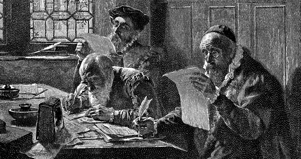
“Reverie Massage Music Playlists” Masthead

Top Menu > Work > Reverie

After having focused on three business mastheads in a row, I was feeling the need to dive into something more fluid and nature-based, design-wise. In fact, that idea had been part of the impulse behind the main Hermit Spirit masthead itself. Or at least something with an organic, textured look, which is what I had originally planned as an underlying theme for most of the mastheads.

You can read more about the Reverie idea here, but in a nutshell, the playlists arose out of the need to put together the right kind of music to accompany regular deep-tissue massage sessions I began getting many years ago. Back then, I had developed repetitive-stress syndrome from years of computer work, tried several different things over an extended period to manage it, and found massage worked better for me in helping do so than almost anything else.

Over time I put together more and more playlists of different types of music, with a common thread running throughout: The music needed to be both relaxing but also captivating, even mesmerizing, for the one lying on the table, but also potentially energizing for the therapist. Definitely not the boring, insipid, saccharine, or sleep-inducing fluff that so much so-called yoga or spa music unfortunately seems to consist of.

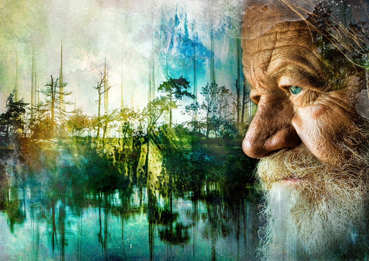
When I decided to create a section of the website for publishing these playlists, I came up with the name “Reverie” to call to mind the daydreamy, absorbing mental state I intended them to elicit. So… when designing the Reverie masthead, what kind of image might best evoke that?
Read more

How the 12 new Hermit Spirit mastheads were designed, Part 2

Go to: Part 1 | Part 2 | Part 3
Images here are from Pixabay unless noted as sourced from iStock. For links to all of the fonts and original images used for Hermit Spirit’s site-wide and section mastheads, see Credits/Colophon.

“The Hangman and the Picture-Hanger Guy” Masthead

Top Menu > Work > Hangman/Picture-Hanger Guy

This was the next header I tackled after the Hermit Spirit blog masthead. Why? Well, the web page it sits atop brings in some extra inquiries for a gig I’m involved with that helps pay the bills. We’re talking basic “keeping the wolf from the door” motivation here. Despite the fact I wasn’t going to release the new website redesign until all headers were complete, I still felt an internal push to create the mastheads publicizing current income-producing endeavors first.

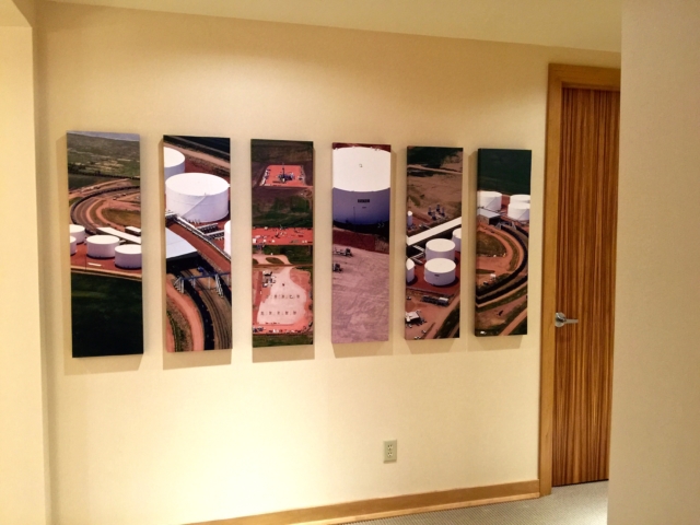
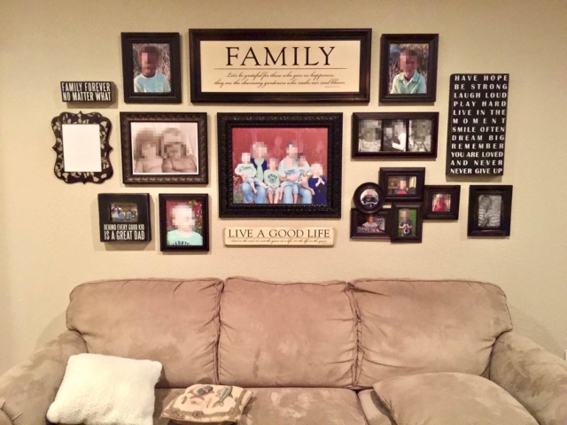
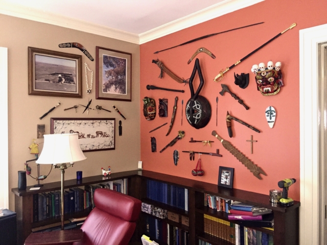
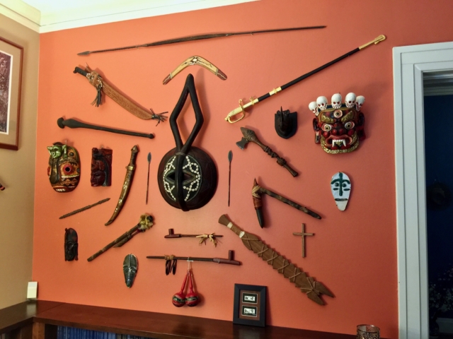
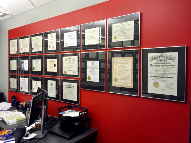
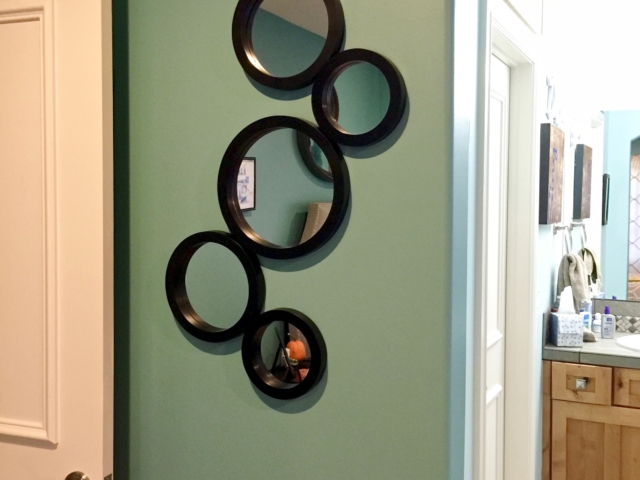
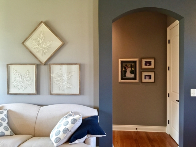
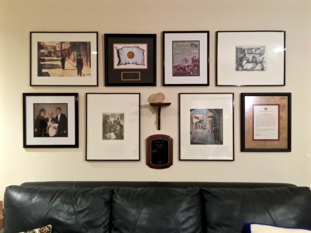
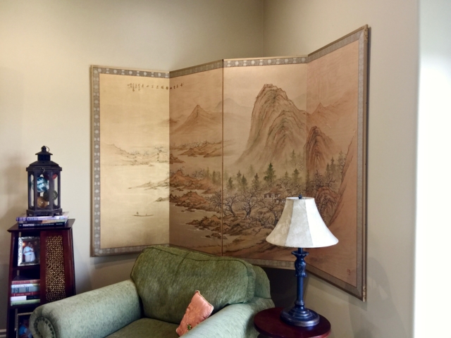
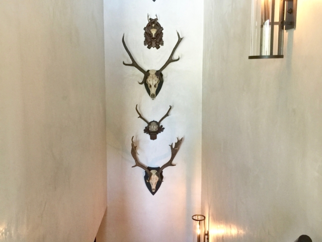
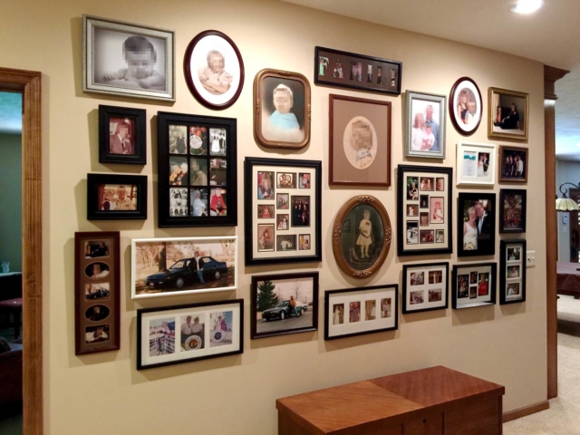
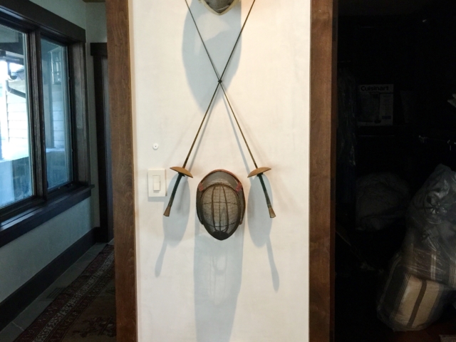
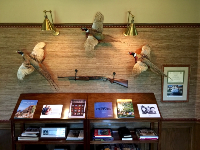
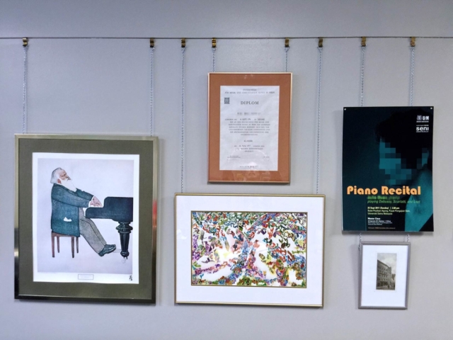
Unlike all the other headers, I didn’t need to search for any images to be used for this one. I’d taken plenty of photos with my smartphone of completed picture groupings and other wall hangings on actual job sites where my partner and I had worked. From those, I narrowed things down to the potential photos shown in the gallery below (click any image to enlarge):

In mulling over how many photos to feature in the masthead and how to arrange them, I realized three photos in the header’s central viewing area would be plenty. Otherwise the layout of the photos themselves would get too “busy,” and they’d need to be significantly reduced in size to fit the available space. That, in turn, would sacrifice graphic impact and good viewability. There was enough going on in any single photo to begin with, since virtually all of them featured groupings rather than lone items on the wall.

When selecting which photos to use, a key aim was showing that we don’t hang just pictures, but almost “anything on a wall” that can be hung. To illustrate that, for the three main photos I chose a large picture grouping we’d done, a second one showing antler mounts, and a third featuring unusual tribal artifacts.

Read more

How the 12 new Hermit Spirit mastheads were designed, Part 1

A look behind the scenes — and how things so often take longer than you think.
Go to: Part 1 | Part 2 | Part 3
Images here are from Pixabay unless noted as sourced from iStock. For links to all of the fonts and original images used for Hermit Spirit’s site-wide and section mastheads, see Credits/Colophon.

A week ago I launched the newly redesigned and rechristened Hermit Spirit website here after about two months of spare-time effort. Two major tasks were involved, the largest designing 12 brand-new mastheads for different sections of the site, including the home page/blog header. At the same time, I wanted to retain the typography and layout I’d previously developed for the main content area (body copy) plus the navigation menus, sidebar, and footer.

The latter task required porting the CSS, or cascading style sheets, from the preceding Think Outside the Box version of the site built on the now-defunct Headway theme into GeneratePress, which the current website uses. (Both are themes for WordPress.) I won’t go into the travails involved with the latter task because it’s code-intensive and not something most readers will care about. But I thought it might be of interest to take a peek behind the scenes at how I designed all the mastheads.

The main “Hermit Spirit” site and blog masthead

Homepage • Also: Top Menu > Blog

First, for comparison, here’s the previous Think Outside the Box blog masthead, followed by my new one for the retitled Hermit Spirit version. (Click on any image in this post to enlarge.)

You’ll notice two things off the bat: The new blog masthead is much simpler, and deeper vertically (at 400 pixels) than the previous one (286 pixels deep). I found that the Think Outside the Box masthead — designed primarily for computer monitors — lost most of its impact on smartphone displays, which are much smaller but have now come to be used for a significant percentage of all web surfing. So my watchwords for the new masthead series were larger and simpler.

Read more

Hermit Spirit blog conversion: interim report

Wardolfski turns over a new leaf with a reasonable-length post (say it ain’t so, Joe!), while his hermit self beavers away designing a new incarnation of the blog.

Things are going well with the website conversion, all things considered, with about five weeks of spare time now into it. I really enjoy the process of envisioning a new direction for any endeavor, whether something ongoing or a fresh start, especially the brainstorming side of things.

It’s a fragile endeavor, though, the ideas coming and going swiftly: for visuals, headlines, layouts. One must be on continual standby to note things down immediately, lest they disappear as evanescently as they flicker before the mind’s eye, trying to catch the proverbial lightning in a bottle. With pen and paper or a computing device at the ready, for a time prisoner of the muse or mistress. Pledged to do her bidding so as not to be cast out before you have obtained both satisfaction and release from your desire.

For me this stage tends to go by relatively quickly. Ideas typically come in a multitude of rapid staccato bursts — an experience of one “high” after another. While there can also be some cognitive dissonance as sometimes-contradictory ideas spew out like fireworks, it’s all part of the process.

As someone who enjoys learning new things and having my head turned upside down occasionally while simmering and percolating through to a new view, cognitive dissonance is to be welcomed because it means things are in flux. And flux, a boiling over of ideas, often chaotic, is a key aspect of the creative process. Eventually, as things evolve, the contradictions resolve themselves, and any ill-fitting pieces puzzled over begin falling into place. A direction progressively becomes clear, but as it does comes the challenge, the hard part: all the detail work required to implement the vision.

Read more

Work has begun on the FontCompass website

Earlier this year, in mid to late January, I finally bit the bullet: I decided to begin work on the long-haul endeavor of turning my private FontCompass universal typeface classification system into a website. Since then, most of my spare time has been devoted to it. Not that I have had nearly as much extra time as I would like. (Does anybody, these days?)

FontCompass began life a number of years ago. Initially it was a project I began putting together to organize my own font library just to speed my graphic design work, and I took the first steps sometime around 2005 or 2006. I’ve written up the basic idea here, but essentially the project was to serve two purposes:

  • To quickly identify typefaces used in customer logos for which they could not furnish me the original artwork, to enable speedily rebuilding them (assuming the fonts needed were present in my library); and
  • To locate typefaces with just the right “look and feel” I wanted for a design project. Since I was trained primarily as a typographer early in my career — and am to some degree a layout artist but not an illustrator or artistically trained graphic designer, which limits my “arsenal” — injecting some typographic allure is a key aspect of my approach to design. Without that, I don’t have a whole lot to offer that’s unique, so FontCompass helped tremendously.

After a year and a half of spare-time work, I had completed the task of classifying all the fonts in my own library, and the creation and buildout of the FontCompass classification scheme itself was also essentially complete. Mostly I used the system for my custom car tags business, Leeward Productions, rebuilding customer logos and designing tags. But it was readily apparent that FontCompass could also provide considerable value to other designers, as well as advertising agencies, if it could somehow be made available to them.

Read more

Achieving enhanced web typography, by a 30-year veteran

Enhanced typography is still difficult to achieve on the web — well over 20 years after the web’s inception, no less — and by now should be much easier, to my way of thinking. As a professional typographer for 30-plus years now, I thought it might be helpful for others to explore how I went about putting that aspect of things together here on Hermit Spirit.

This overview takes a look at the various typographic elements I’ve given special treatment on the Hermit Spirit blog and website, including a number of WordPress plug-ins that have been utilized. For those who are more intrepid, what’s covered in this post should hopefully be enough as a jumping-off point to help get started implementing these solutions as well. Although I had experience hand-coding a couple of previous websites (HTML and CSS, though not more advanced code like JavaScript or PHP), I myself could certainly have used an overview like this over a year ago when I began trying to get Hermit Spirit going in my spare time using WordPress.

Read more

css.php