Gaining the luxury of time by doing less, Part 1

To disengage from America’s culture of excess so you can begin doing less, first you have to feel good about it. So to start with, Part 1 cuts loose with a rant flogging the nation’s collective psychosis of overwork, overconsumption, and overbusyness to help make it easy to jettison the guilt.
Go to: Part 1 | Part 2 | Part 3 | Part 4 | Part 5 | Part 6

Where the nation is now: looking into the funhouse mirror

In America today, we are living in an age of extreme excess and imbalance. Most do not see it, of course. We cannot see it, because nearly everyone has “drunk the well water” and regards it as normal. Even those of us who do consider this excess warped or perverse may still feel a certain amount of it to be unavoidable or inevitable: “Go along to get along,” in so many words.

But this excess and imbalance is not simply a matter of the country’s unbridled consumerism. Fueling our excessive purchases and collective philosophy of “living large” — otherwise known as “the American way of life” and famously termed “not negotiable” by President George Bush Sr. — is the other side of the coin of modern excess: working slavishly hard and feeling we need to keep busy all the time. For without these twin talismans of ambition, we could not pay for nor would we feel compelled to indulge in the overbusy, overconsumeristic lifestyle so many of us believe we should have.

Even with them, we still cannot afford some of our unrestrained purchases, and so with the addition of debt-fueled spending we can add “overextended” to the description of our outsize appetites. Below is a representative roundup of the most typical items in the nation’s lifestyle that keep us indebted to what we could call the four “O”s of overwork, overconsumption, overbusyness, and overextendedness.
Read more

New neighbors: the end of a long, quiet season

Go to: Part 1 | Part 2 | Part 3

Our new next-door neighbors moved in this past February, and we had introduced ourselves to each other and begun on good terms. But a few weeks later, I was regretting an outburst I had indulged in a moment of anger and frustration. An outburst that might have undermined the still-newly-fledged goodwill between us.

There had been ungodly noise coming from their backyard, a terrible screeching that continued longer and louder than I thought permissible for anyone civilized enough to be aware of the need for consideration of their neighbors. I assumed the noise must be coming from their five kids who at the moment were outside, hollering and shrieking as they played. Or perhaps it might be coming from some noisemaking children’s toy or device newly on the market that some money-is-our-god capitalist had struck gold with, now set to invade the already loud-as-hell American soundscape nationwide.

The kids had been very noisy on an ongoing basis almost from the beginning, which I tried to tolerate for a time. But this went considerably beyond previous intrusions: the straw that broke the camel’s back. Anger rising within me at the violation, my emotions began to boil over. I yelled over the tall, stockade-style wooden fence that hid the neighbors’ yard from view — as forcefully as I could without damaging my delicate vocal cords — “Hey! Hey! Can you pipe it down over there!?” No response.

The ungodly screeching continued. So I repeated my combined query and command, “Hey! Heyyy! Can you pipe it down over there!?” Whereupon I heard back from an adult male voice, “No!”

Read more

How the 12 new Hermit Spirit mastheads were designed, Part 3

Go to: Part 1 | Part 2 | Part 3
Images here are from Pixabay unless noted as sourced from iStock. For links to all of the fonts and original images used for Hermit Spirit’s site-wide and section mastheads, see Credits/Colophon.

“Reverie Massage Music Playlists” Masthead

Top Menu > Work > Reverie

After having focused on three business mastheads in a row, I was feeling the need to dive into something more fluid and nature-based, design-wise. In fact, that idea had been part of the impulse behind the main Hermit Spirit masthead itself. Or at least something with an organic, textured look, which is what I had originally planned as an underlying theme for most of the mastheads.

You can read more about the Reverie idea here, but in a nutshell, the playlists arose out of the need to put together the right kind of music to accompany regular deep-tissue massage sessions I began getting many years ago. Back then, I had developed repetitive-stress syndrome from years of computer work, tried several different things over an extended period to manage it, and found massage worked better for me in helping do so than almost anything else.

Over time I put together more and more playlists of different types of music, with a common thread running throughout: The music needed to be both relaxing but also captivating, even mesmerizing, for the one lying on the table, but also potentially energizing for the therapist. Definitely not the boring, insipid, saccharine, or sleep-inducing fluff that so much so-called yoga or spa music unfortunately seems to consist of.

When I decided to create a section of the website for publishing these playlists, I came up with the name “Reverie” to call to mind the daydreamy, absorbing mental state I intended them to elicit. So… when designing the Reverie masthead, what kind of image might best evoke that?

Read more

How the 12 new Hermit Spirit mastheads were designed, Part 2

Go to: Part 1 | Part 2 | Part 3
Images here are from Pixabay unless noted as sourced from iStock. For links to all of the fonts and original images used for Hermit Spirit’s site-wide and section mastheads, see Credits/Colophon.

“The Hangman and the Picture-Hanger Guy” Masthead

Top Menu > Work > Hangman/Picture-Hanger Guy

This was the next header I tackled after the Hermit Spirit blog masthead. Why? Well, the web page it sits atop brings in some extra inquiries for a gig I’m involved with that helps pay the bills. We’re talking basic “keeping the wolf from the door” motivation here. Despite the fact I wasn’t going to release the new website redesign until all headers were complete, I still felt an internal push to create the mastheads publicizing current income-producing endeavors first.

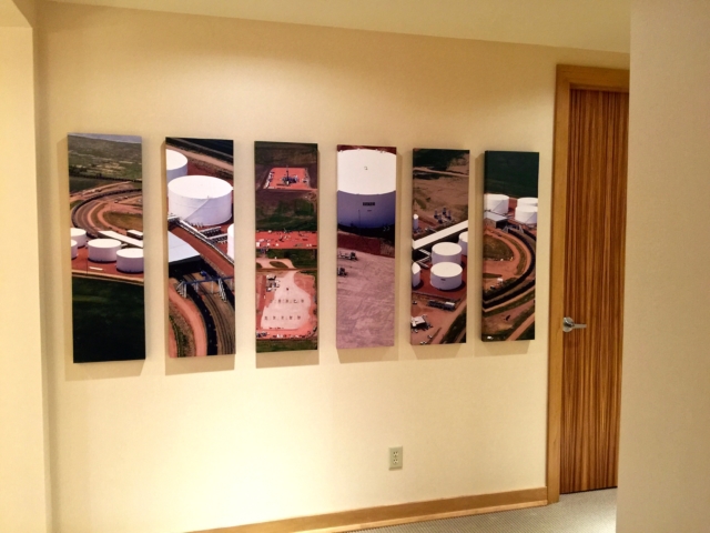
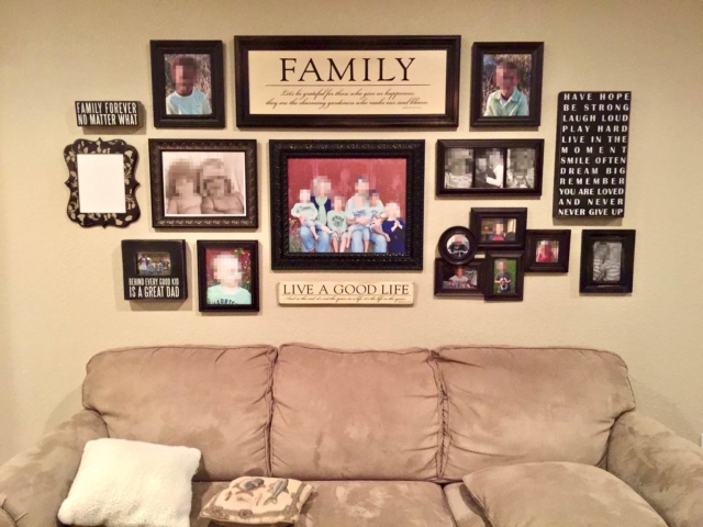
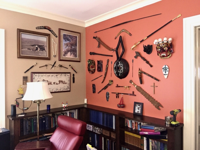
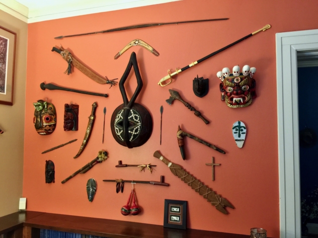
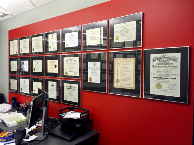
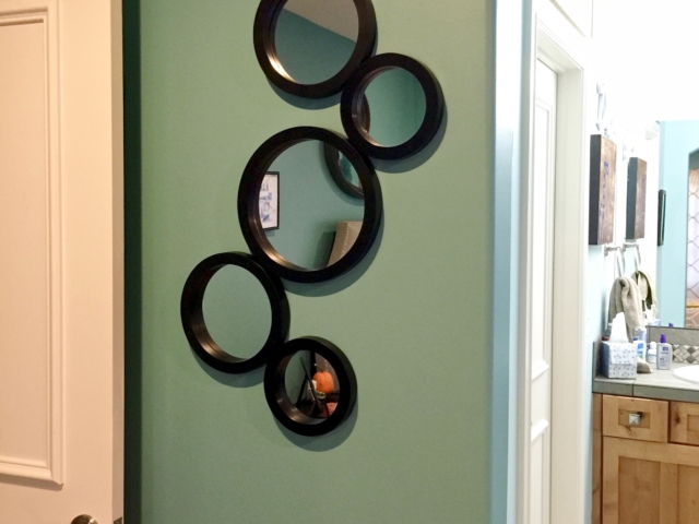
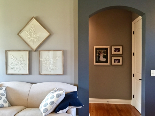
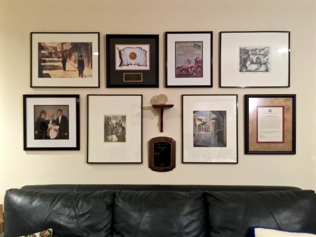
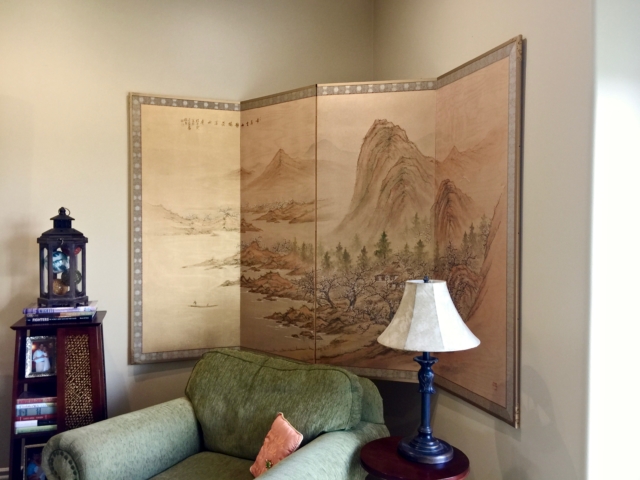
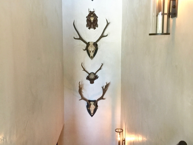
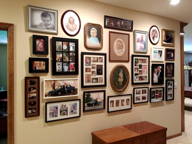
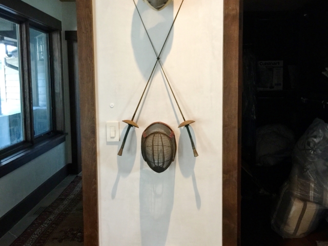
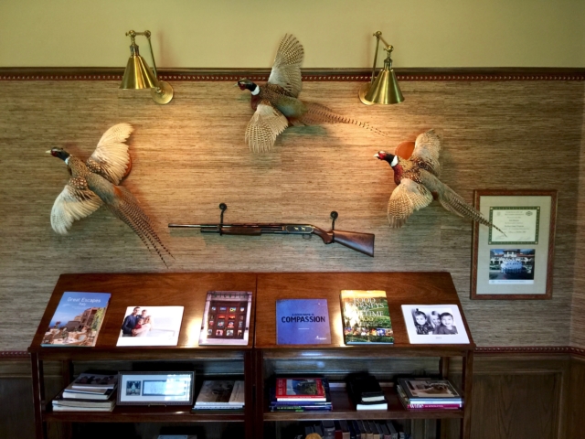
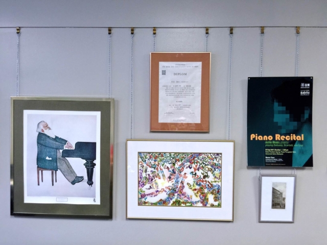
Unlike all the other headers, I didn’t need to search for any images to be used for this one. I’d taken plenty of photos with my smartphone of completed picture groupings and other wall hangings on actual job sites where my partner and I had worked. From those, I narrowed things down to the potential photos shown in the gallery below (click any image to enlarge):

In mulling over how many photos to feature in the masthead and how to arrange them, I realized three photos in the header’s central viewing area would be plenty. Otherwise the layout of the photos themselves would get too “busy,” and they’d need to be significantly reduced in size to fit the available space. That, in turn, would sacrifice graphic impact and good viewability. There was enough going on in any single photo to begin with, since virtually all of them featured groupings rather than lone items on the wall.

When selecting which photos to use, a key aim was showing that we don’t hang just pictures, but almost “anything on a wall” that can be hung. To illustrate that, for the three main photos I chose a large picture grouping we’d done, a second one showing antler mounts, and a third featuring unusual tribal artifacts.

Read more

css.php